
The challenge
The solution
The process

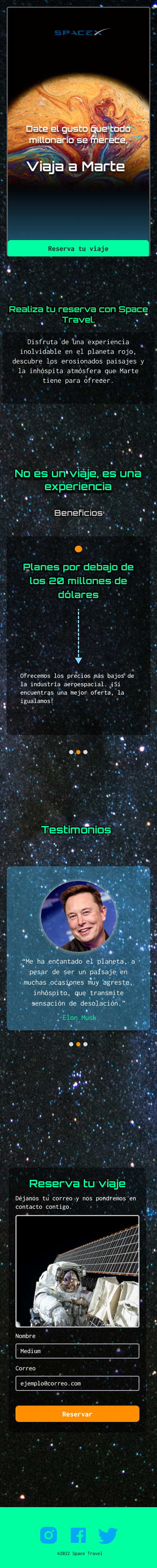
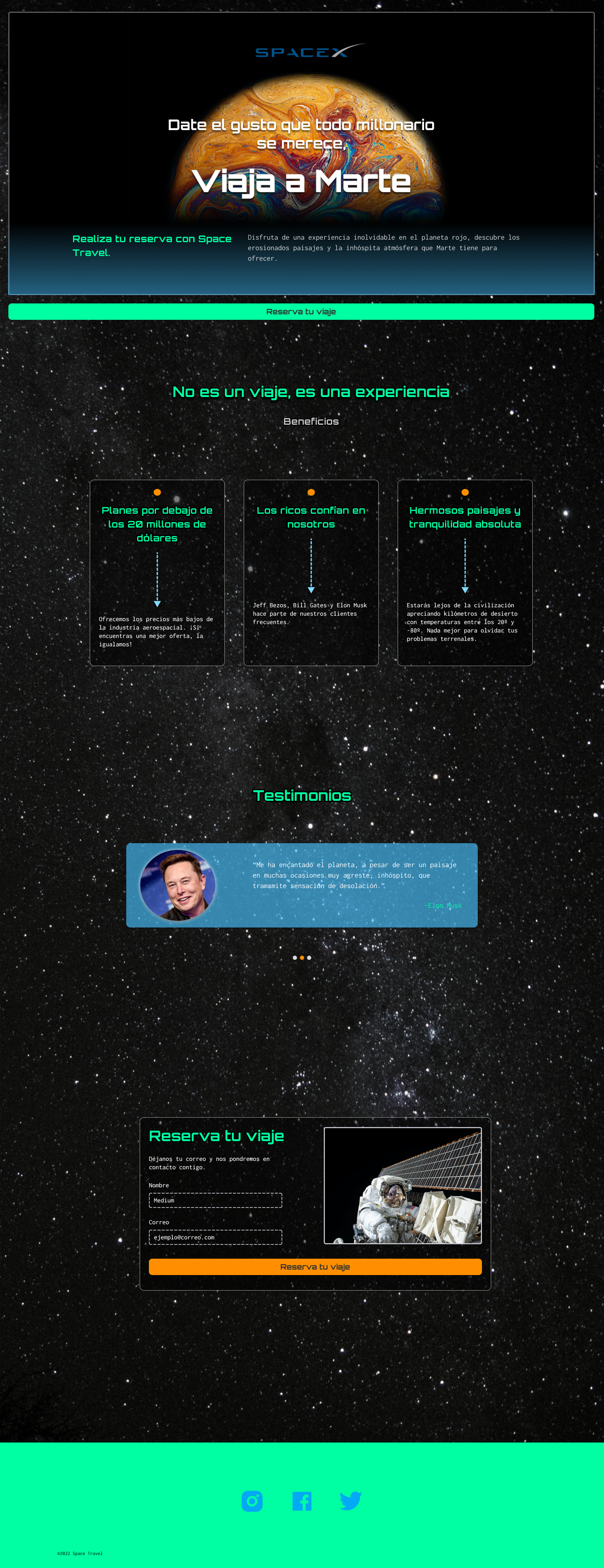
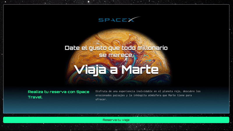
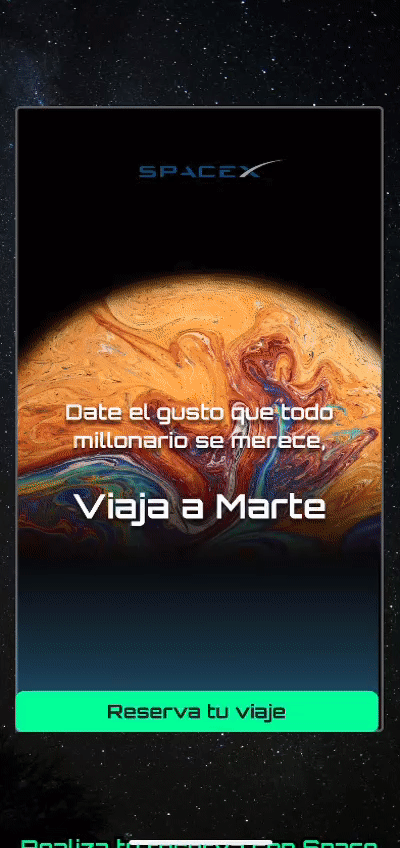
Travel Beyond
How to design an attractive Landing Page to sell space travels?
THE SOLUTION
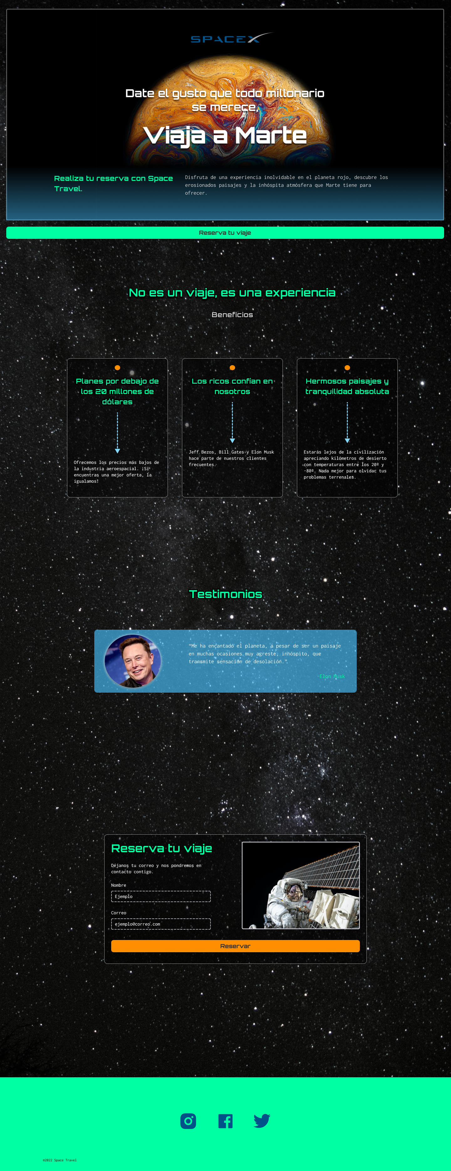
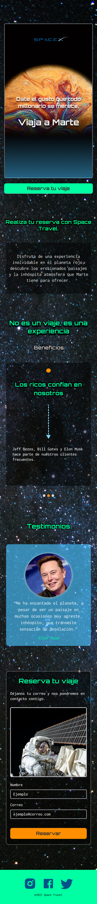
Travel Beyond is a responsive Landing Page designed to inspire truste and excitment around space travels, clearly communicating the value proposition, guiding users through the experience, and driving conversions across devices.
Rol: User interface Designer


HAVE MORE TIME?
DIG IN!
THE PROCESS
Travel Beyond: the design process explained
RESEARCH
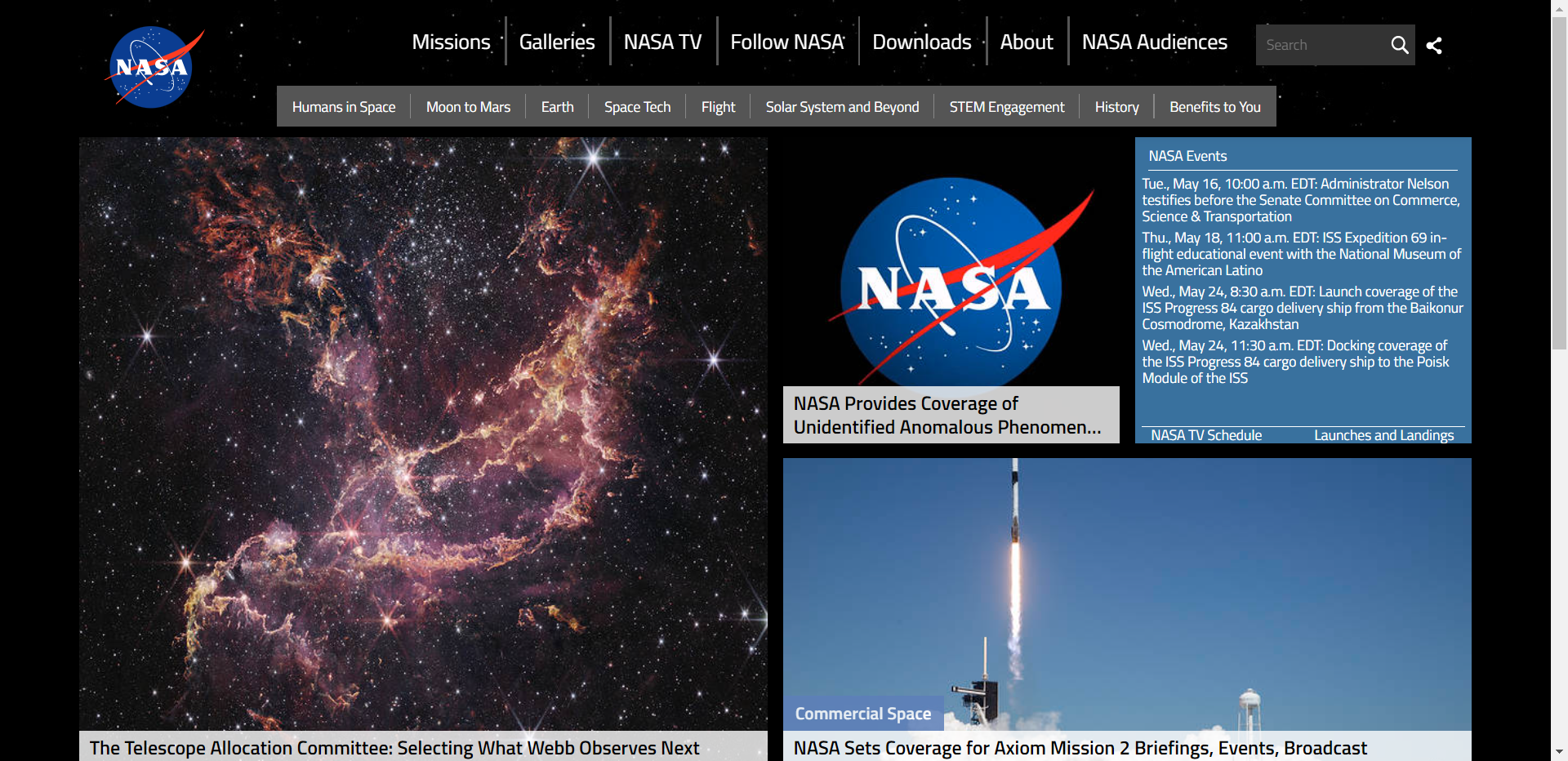
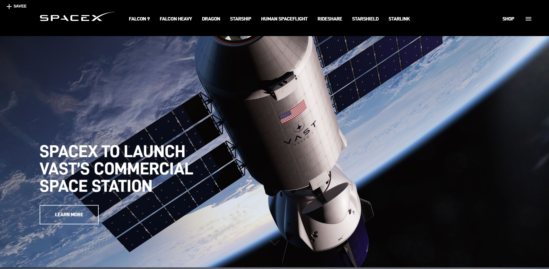
Benchmarking: Competitive analysis and industry benchmarks.
Common patterns were: dark backgrounds, blue, black and white color for texts, sans- serif slightly rounded edge fonts, and dominance of photos on layouts.

How does the competition deal with it?
What has already been done?


PRODUCT VISION
Travel Beyond is designed for users who can afford the luxury and courage to be the first to travel into space.
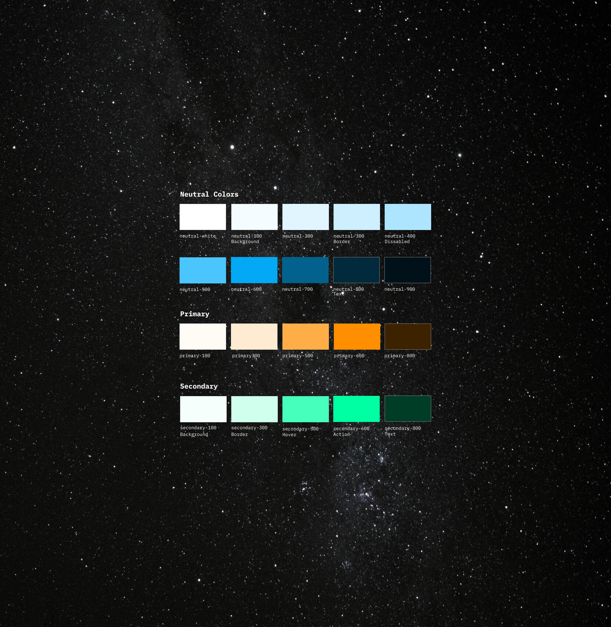
In doing so, this interface was designed based on colors that can call recall the planet Earth (blue, green and earthy browns) aswell as Natural Sciences (grey for metals, and green for science)
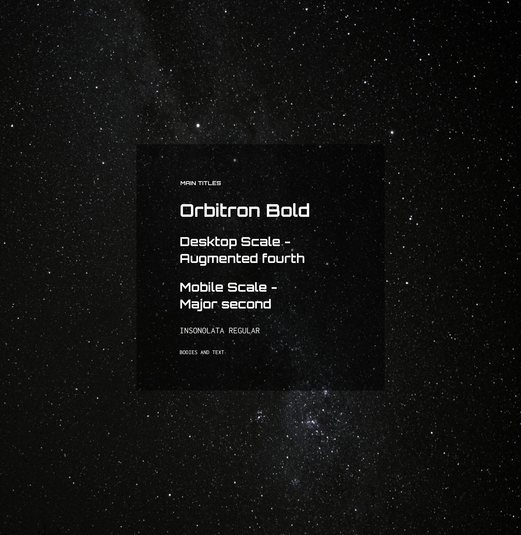
Lastly, a Geometric sans-serif Typography was choosen to evoque a Scientific and trustie sensation into the UI, keeping the rounding eadges to make it more friendly and open to the user.
Techy, Trustie, Quirky, and Minimalist
¿How to express visually the values for Travel beyond?


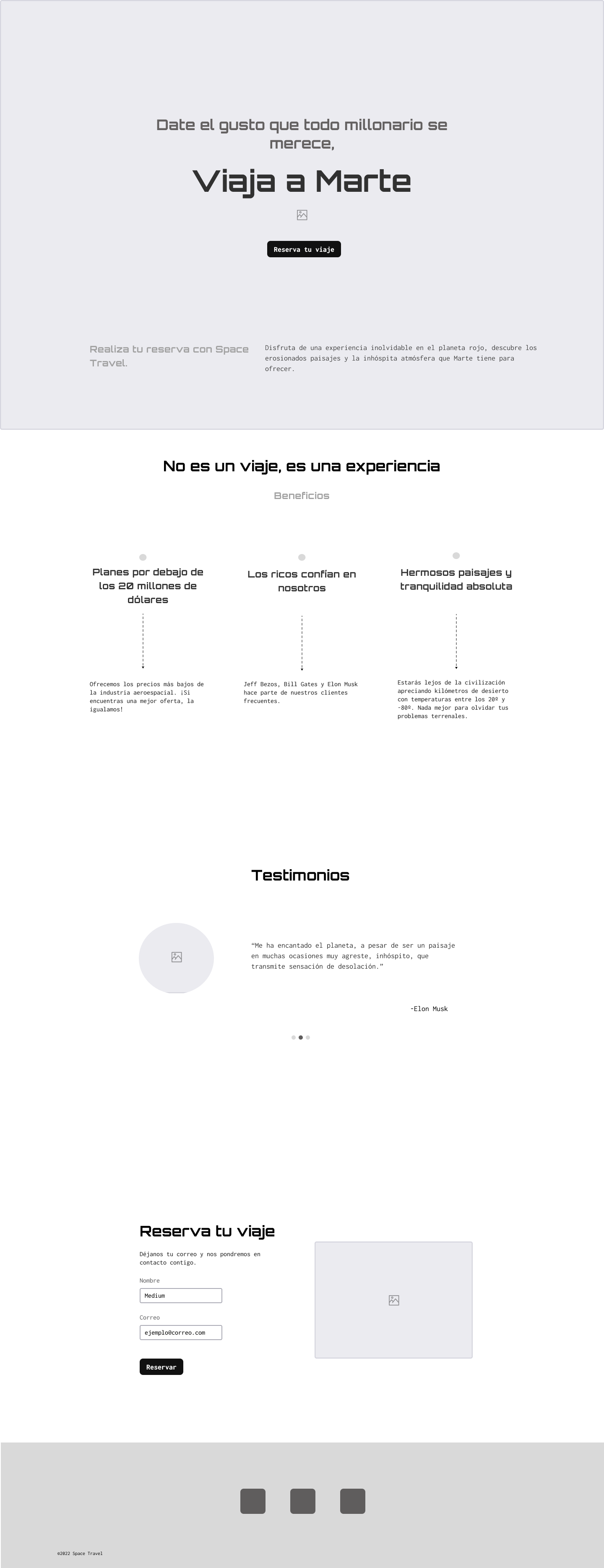


In order to work on an iterative process for rapid prototyping, Mid-fidelity wirefrmaes were used to validate the idea.


OTHER WORKS

Vega
How to help people who wants to change the way they impact on the planet by changing how they eat?
MoodFlix
Many people find it difficult to find films to watch that match their mood

Travel Beyond
How to design an attractive Landing Page to sell space travels?
THE SOLUTION
Travel Beyond is a responsive Landing Page designed to inspire truste and excitment around space travels, clearly communicating the value proposition, guiding users through the experience, and driving conversions across devices.
Rol: User interface Designer


01
The challenge
02
The solution
03
The process
HAVE MORE TIME? DIG IN!
THE PROCESS
Travel Beyond: design process explained
RESEARCH

Benchmarking: Competitive analysis and industry benchmarks.
Common patterns were: dark backgrounds, blue, black and white color for texts, sans- serif slightly rounded edge fonts, and dominance of photos on layouts.
How does the competition deal with it?
What has already been done?
PRODUCT VISION
Techy, Trustie, Quirky, and Minimalist
Travel Beyond is designed for users who can afford the luxury and courage to be the first to travel into space.
In doing so, this interface was designed based on colors that can call recall the planet Earth (blue, green and earthy browns) aswell as Natural Sciences (grey for metals, and green for science)
Lastly, a Geometric sans-serif Typography was choosen to evoque a Scientific and trustie sensation into the UI, keeping the rounding eadges to make it more friendly and open to the user.
¿How to express visually the values for Travel beyond?


In order to work on an iterative process for rapid prototyping, Mid-fidelity wirefrmaes were used to validate the idea.

OTHER WORKS
Vega
How to help people who wants to change the way they impact on the planet by changing how they eat?
MoodFlix
Many people find it difficult to find films to watch that match their mood